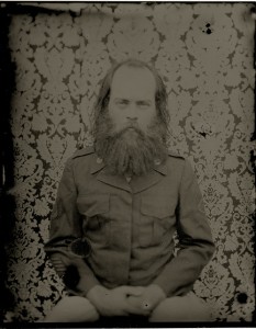
They’ve started using Victorian photographic processes again. Here’s a tin type by Joshua Black Wilkins:

It’s not just tin types: skilled photographers are also revisiting the calotype, the daguerrotype and the whole raft of Victorian formats that took photography from being a rich man’s extraordinary hobby in 1848 to everyone’s with the arrival of the Kodak No. 1 just before the nineteenth century’s end. Do you know what happens to a person when they’re photographed using a Victorian process? They come out looking Victorian. Here’s the 1948 Olympic Games in London in colour – first the cycling tandem race at Herne Hill Velodrome, then the long road race out of Windsor. The countryside is ravishing, and there’s a crash, a punch-up and a truly terrific sulk:
The thing is, if Victorian photographic processes make us look Victorian, then there’s every chance that the reverse is also true: the people who looked Victorian in Victorian photographs looked like us.
Because there’s something distancing about black and white photography. However good a Victorian photograph might be – and Shorpy is laden with some astonishing ones: just search under “beach” and see what arrives – it’s not a window onto the past in quite the way a colour photograph can be. Or if it is a window, it’s smeared and you can’t open it.
Black and white photography distances you from its subject. It dignifies the subject. It sets them away from or above the modern. When I was a child turning the pages of the old family albums, two things seemed obvious. One was that my grandfather’s early death in ’54 had been one of Larkin’s “stun(s) to memory” and that my family never took photographs in the same way again. And the other was that these serious-faced, smartly-dressed people had an air of knowing what they were doing, of what life was for, that I did not see anywhere in the 1970s world around me.
That at least was an illusion. My family in the 1900s, 1910s and 1920s were winging it every bit as much as we all do now. But it was a photographic illusion. Black and white photographs hid the drink on the breath, the sewage smell, the envy and jostling for the camera, the worry about bills, the worry about love and illness. Black and white photography made the world look better than ours.
Of course, the past looks safer anyway from our perspective. We know what’s going to happen. Nuclear war didn’t come in the ’50s, and so it’s easy to strip it out of those pictures of relatives waving from departing trains as though it was never part of their world at all. People who lived unworried childhoods naturally project their early sense of safety back onto the whole culture that surrounded their infancy.
I cheated, by the way. This next clip is from 1953 – the Tour de France.
The internet has sparked a great loft clear out – so much early colour film, or early-ish by 1948 and 1953, has come to light since restoration and digital distribution made it all worthwhile that before long its psychological impact on history has to be felt. There’s not the distance of black and white with colour; colour forces you to acknowledge that our forebears were just people like ourselves, not some kind of Greatest Generation that we have betrayed. If only the colour cameramen had ventured into the Gorbals or the East End, to show what sort of life the lovely people of the past thought was good enough for those without money – and perhaps they did, and perhaps this will be the next to emerge.
It makes you think about death, too, of course. Old colour film is an excellent momento mori. There they are through the window, our grandparents and great-grandparents, just living, just getting on with things. But it’s sixty years ago, seventy years ago, and your brain does the maths: the accident, the long last illness, the sudden tearing coronary, the cancer of the brain, has happened, already.
fff
